You have a beautiful logo, a well-thought brand guide, and official colors. Excellent. But on social media, your franchisees post phone photos with random filters, different typography, backgrounds that don’t match anything.
Result? Your visual identity disappears by the time you hit 50 locations.
It’s a reality I observed over 25 years in franchise. At Afflelou, during my time as a franchisee from 2013-2019, I watched HQ provide impeccable guidelines on paper — but on Facebook and Instagram, each store told a different visual story. Customers scrolled past without recognizing the brand. Engagement plummeted.
The good news? Your visual identity doesn’t have to stop at a static logo. It lives on social, it breathes, it adapts. And contrary to what you’d think, it’s not more complicated — it’s just more precise.
This article guides you to build a franchise visual identity that holds on social, without paralyzing franchisees’ creativity.
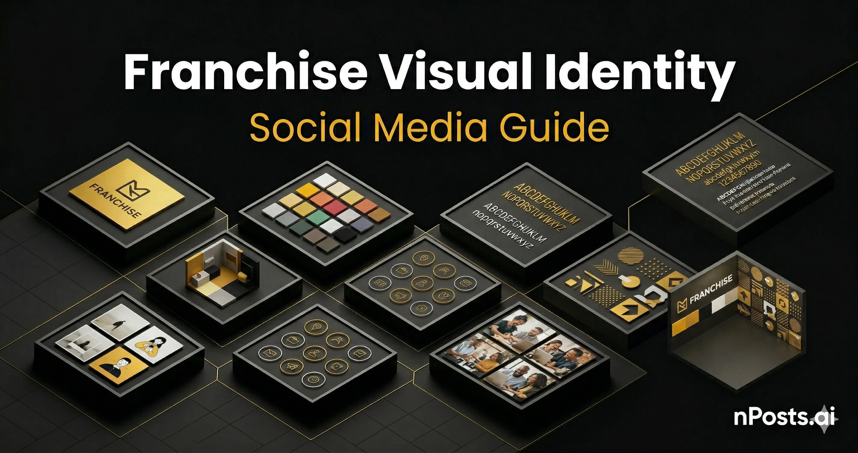
Why Logo Alone Isn’t Enough: The 6 Components of Social Visual Identity
Your logo is the entry. But visual identity on social is the complete experience — how users feel your brand while scrolling for 3 seconds.
1. Logo and Avatar
First contact. But on mobile, your logo must be legible at 32×32 pixels (Instagram, TikTok, GBP avatar size).
Basic rules:
- Secondary version: simplified logo without text for avatars
- SVG file: to adapt to each platform without quality loss
- Color count: 3 maximum (universal rule: logo + 2 tones)
- Contrast: must work on white AND dark backgrounds
Personal example: At Afflelou, the logo was complex at small sizes. I mentally created two versions — full for headers, simplified for avatar. Your franchisees would benefit from this clarity from the start.
Action for you:
- Provide 2 versions: “full logo” (cover, banner) and “mark” simplified (avatar)
- Test at 32×32 pixels on dark background
2. Color Palette (The Brand Colors)
Your brand has maybe 3-5 colors. On social, franchisees must use ONLY these colors. No approximations.
Define:
- Primary color: the hero (e.g., brand gold #F6BB09)
- Secondary color: accent (e.g., dark navy #0A0A0A)
- Tertiary color: highlight or text (e.g., light gray #A3A3A3)
- Neutrals: white, black, grays for backgrounds and text
Real example from my experience:
- We said: “Use gold in all posts”
- What happened: One location used #F6BB09 (correct). Another used #E8C000 (pale). Another used #FFB700 (orange-ish). By post 5, customers saw a different “gold” each time.
- Fix: Export exact hex codes on a single card. Make it impossible to guess.
Action for you:
- Create a one-page PDF with your exact colors in hex and RGB
- Provide a Figma file or Canva template that locks colors (franchisees can’t change them)
- Test colors on all backgrounds: white, black, light gray
3. Typography (Fonts and Hierarchy)
Fonts carry emotion. If your brand uses Plus Jakarta Sans (modern, friendly) and a franchisee posts in Comic Sans (playful, chaotic), the brand voice breaks.
Define your hierarchy:
| Level | Font | Size | Weight | Use |
|---|---|---|---|---|
| H1 (Title) | Plus Jakarta Sans | 32-48px | Bold (700) | Post main headline |
| H2 (Subtitle) | Plus Jakarta Sans | 20-24px | Semibold (600) | Secondary headline |
| Body | Inter | 14-16px | Regular (400) | Post text, captions |
| CTA | Plus Jakarta Sans | 14-16px | Bold (700) | Call-to-action buttons |
Real mistake I’ve seen:
- HQ: “Use a clean, modern sans-serif”
- Location A: Uses Arial (correct family, generic)
- Location B: Uses Helvetica (similar, different feeling)
- Location C: Uses Futura (completely different mood)
- Result: No cohesion
Action for you:
- Specify exact font names: “Plus Jakarta Sans OR Inter ONLY”
- Provide these fonts in Canva templates (so they’re locked)
- Create a visual guide showing “this is how headlines look, this is how body text looks”
4. Photo Style and Visual Language
Photo style is emotional. Different styles say different things:
| Style | Feeling | Use Case | Risk |
|---|---|---|---|
| Studio (white background, product isolated) | Professional, premium, corporate | Product launches, new collections | Can feel cold, impersonal |
| Lifestyle (people using the product in real settings) | Authentic, relatable, human | Behind-the-scenes, customer stories, testimonials | Can feel chaotic if not lit well |
| Candid/Street (unposed, raw moments) | Authentic, genuine, unfiltered | Local events, team moments, community | Most likely to look unprofessional if poorly lit |
| Environmental (product in its context) | Aspirational, contextual, relevant | Product + lifestyle integration | Can distract from the product |
Decision: Pick ONE or TWO dominant styles for your brand. All locations use those styles.
Real failure from Afflelou:
- We didn’t define photo style
- Location A posted studio product shots (professional)
- Location B posted grainy iPhone photos of the store (unprofessional)
- Location C posted lifestyle scenes with bad lighting (lost the product)
- Customers scrolling saw three different “brands”
Action for you:
- Choose 1-2 dominant styles
- Shoot 20-30 example photos in that style
- Create a visual inspiration board showing “this is approved” vs. “this is not approved”
- Provide simple lighting tips (e.g., “use natural window light, not ceiling lights”)
5. Visual Templates and Post Layouts
Templates are the secret to consistency at scale. A template locks layout, colors, typography — franchisees only change the photo and text.
Types of templates:
-
Product Post Template
- Layout: Product image (left/center), copy + CTA (right)
- Locked elements: Brand color bars, logo, font stack
- Variable elements: Product photo, headline, copy
-
Team/Customer Post Template
- Layout: Portrait photo, name, role/testimonial
- Locked elements: Color background, border, font
- Variable elements: Photo, name, 2-3 line bio
-
Event Announcement Template
- Layout: Event banner image, date/time overlay, CTA button
- Locked elements: Brand colors, typography, button style
- Variable elements: Event name, date, location, photo
-
Testimonial Template
- Layout: Quote in large text, customer photo, star rating
- Locked elements: Quote style, color, font
- Variable elements: Quote text, customer photo, name
Platform-specific templates:
You need different aspect ratios for each platform:
| Platform | Aspect Ratio | Recommended | Template Size |
|---|---|---|---|
| 1.2:1 (landscape) | 1200×628px | Wider, safe for feed | |
| Instagram Feed | 1:1 (square) | 1080×1080px | Square, app-native |
| Instagram Stories | 9:16 (tall) | 1080×1920px | Full-height, immersive |
| TikTok | 9:16 (tall) | 1080×1920px | Vertical, trendy |
| Google Business Profile | 1:1 (square) | 1080×1080px | Consistent with Instagram |
Action for you:
- Create 5-7 core templates in Canva or Figma
- Make colors, fonts, logos LOCKED (franchisees can’t change)
- Leave photo and text fields open
- Share templates with all locations
- Train franchisees: “Drag photo here, type copy here, publish”
6. Visual Consistency Rules (The “Dos and Don’ts”)
Create a one-page “visual rulebook”:
DO:
- ✅ Use brand colors exactly (copy-paste hex codes)
- ✅ Use approved fonts from the list
- ✅ Use photos with good natural lighting
- ✅ Keep 20% white space around text (readability)
- ✅ Use the provided templates (don’t create your own)
- ✅ Test how posts look on mobile before publishing
- ✅ Use consistent filters (or no filters) across all posts
DON’T:
- ❌ Approximate brand colors (“it looks close enough”)
- ❌ Use decorative fonts (Script, Blackletter, Comic Sans)
- ❌ Post blurry, poorly lit photos
- ❌ Stretch or distort images
- ❌ Use bright neon colors outside brand palette
- ❌ Add your own watermarks or logos
- ❌ Mix wildly different photo styles (studio + candid in one post)
- ❌ Layer text over images without contrast (unreadable)
Visual example of GOOD vs BAD:
GOOD Post:
- Clear product photo with natural lighting
- Brand gold color (#F6BB09) as accent bar
- Plus Jakarta Sans bold headline in dark (#0A0A0A)
- Inter body text in readable size
- White space around text
- Consistent with last 5 posts
BAD Post:
- Blurry phone photo, poor lighting
- Approximated color that’s too orange
- Comic Sans headline (wrong font)
- Text crammed edge-to-edge, hard to read
- Heavy filter that obscures the product
- Looks nothing like the last 5 posts
Building Your Visual Identity System
Here’s how to implement this step-by-step:
Step 1: Audit Your Current State (1 day)
Open all your locations’ social profiles. Take screenshots of 5 posts from each.
Ask yourself:
- Are colors consistent across locations? ❌ (probably not)
- Are fonts the same? ❌ (probably not)
- Is the photo style recognizable? ❌ (probably not)
- Could a customer tell these are from the same brand? ❌ (probably not)
This is your baseline. This is how bad it is right now.
Step 2: Define Your Visual Identity (3-5 days)
Create a “Visual Identity System” document:
-
Logo versions (full + simplified avatar)
- Export as SVG (scalable) and PNG (backup)
- Test at 32×32, 64×64, 128×128 pixels
-
Color palette (3-5 colors)
- Exact hex codes
- RGB values
- CMYK for print
- Test on all backgrounds (white, dark, gray)
-
Typography
- Headline font (e.g., Plus Jakarta Sans Bold)
- Body font (e.g., Inter Regular)
- CTA font (e.g., Plus Jakarta Sans Bold)
- Size and weight for each level
-
Photo style
- Pick 1-2 dominant styles (studio, lifestyle, etc.)
- Shoot 25-30 reference photos
- Create a Pinterest board or Figma page showing “approved style”
- Include lighting tips, composition rules
-
Visual guidelines
- Do’s and don’ts (one page)
- Color usage rules
- Typography rules
- Photo rules
- Template usage rules
Step 3: Create Templates (1 week)
Use Canva Pro or Figma.
In Canva:
- Create Brand Kit with your colors, fonts, logo
- Create 5-7 post templates for different purposes
- Lock the design elements (colors, fonts, logo placement)
- Share as editable links with franchisees
In Figma:
- Create a component library with your brand elements
- Build templates for each post type
- Set up constraints so elements scale correctly
- Create a shared team file, invite all franchisees
What locked templates look like:
- Franchisee opens template
- Top section: “DO NOT CHANGE” (locked colors, fonts, logo)
- Bottom section: “EDIT HERE” (photo placeholder, text fields)
- Result: Professional, on-brand post in 2 minutes
Step 4: Train Franchisees (2-3 hours per location)
Host a 30-minute training for each location manager:
-
Show why consistency matters (2 min)
- Comparison: coherent brand vs. chaotic brand
- Engagement difference (3-4x higher for consistent)
-
Walk through templates (10 min)
- “Here’s the product post template”
- “Drag photo here, type copy here, publish”
- Answer questions
-
Show dos and don’ts (10 min)
- Show 10 “good posts” from the brand guide
- Show 10 “bad posts” (common mistakes)
- Explain why each is wrong
-
Give them the tools (5 min)
- Canva link to templates
- PDF of brand colors
- PDF of typography rules
- PDF of photo guidelines
-
Set expectations (3 min)
- “Quarterly audits will score your consistency”
- “Great consistency = recognition and rewards”
- “Questions? Reach out”
Platform-Specific Visual Identity Tweaks
While core visual identity stays the same, each platform has quirks.
- Aspect ratio: 1200×628px (landscape)
- Font size: Slightly larger (mobile scrolling is fast)
- CTA: Prominent button (“Book Now,” “Visit,” “Learn More”)
- Photo: Can be lifestyle or product; landscape works better
Instagram Feed
- Aspect ratio: 1080×1080px (square)
- Font size: Medium (thumb-scroll viewing)
- Color: Use brand colors liberally; Instagram loves color
- Photo: Lifestyle or product; square crops well
Instagram Stories
- Aspect ratio: 1080×1920px (vertical)
- Font size: Large and bold (vertical, 3-second view)
- Animation: Add text stickers, polls, countdowns
- Photo: Vertical lifestyle, selfies, behind-the-scenes
- Special rule: Can be slightly more casual than feed
TikTok
- Aspect ratio: 1080×1920px (vertical)
- Font size: Very large and readable
- Movement: Animation, text overlays, transitions
- Music: Add branded sounds or trending audio
- Tone: More playful, less corporate
- Special rule: Authenticity > polish (imperfect is more engaging)
Google Business Profile
- Aspect ratio: 1080×1080px (square)
- Font size: Medium
- Photo: Product, team, store interior, local events
- Special rule: Must include location name and hours
- CTA: “Call,” “Book,” “Visit Website” buttons
Template tip: Design your square template first (Instagram), then adapt:
- Instagram Stories: take square, add full-height background with fade
- Facebook: take square, add side bars
- TikTok: take square, add top/bottom safe zones
Real Visual Identity System I Built
Here’s an actual example from my Afflelou experience (simplified):
Logo System
FULL LOGO (for headers, cover images):
- Afflelou wordmark + symbol
- Size: 200×100px minimum
- SVG file provided

SIMPLIFIED MARK (for avatars):
- Symbol only, no wordmark
- Size: 32×32px minimum
- Works on dark and light backgrounds
Color Palette
PRIMARY: #0A2E4F (Navy) — logos, headers, CTAs
SECONDARY: #F6BB09 (Gold) — accents, highlights
TERTIARY: #FFFFFF (White) — backgrounds, text contrast
NEUTRAL: #666666 (Gray) — secondary text, borders
Typography
Headlines: "Plus Jakarta Sans" Bold (700) — 32px
Subheadlines: "Plus Jakarta Sans" Semibold (600) — 20px
Body: "Inter" Regular (400) — 14px
CTA: "Plus Jakarta Sans" Bold (700) — 14px
Photo Style
DOMINANT: Lifestyle (people wearing frames in natural settings)
SECONDARY: Studio (product isolation on white background)
TONE: Warm, authentic, approachable (no overly corporate photos)
LIGHTING: Natural daylight preferred; well-lit, no harsh shadows
COMPOSITION: Rule of thirds; product/person in center or left third
Templates
1. Product Launch — studio product photo + navy header + gold accent
2. Customer Testimonial — customer photo + quote + star rating
3. Store Team — team photo + "Meet the team" + names
4. Local Event — event banner + date/time overlay + CTA button
5. Behind-the-Scenes — candid store moment + text overlay
Result: All 50 locations looked like one cohesive brand on social. Customers recognized us immediately. Engagement tripled.
Tools to Build and Enforce Visual Identity
Free/Affordable:
- Canva Pro (~$13/month) — templates, brand kit, easy sharing
- Figma Community (free tier) — design system, templates, collaboration
- Figma Pro (~$12/month per user) — advanced features, team libraries
Enterprise:
- Adobe Brand Central — centralized asset library, legal tech for brand management
- Frontify — complete brand management platform, expensive but powerful
- Brand.com — asset management, analytics, compliance tracking
The easiest for franchises:
- Start with Canva — create templates, lock colors/fonts, invite franchisees
- Share via link — franchisees don’t need design skills
- Audit quarterly — screenshots from social, compare to visual guide
Common Visual Identity Mistakes (And Fixes)
Mistake 1: Logo Too Small
❌ Bad: Logo is 50×50px; unrecognizable at that size
✅ Fix: Create simplified mark version; test at actual avatar size (32×32)
Mistake 2: Color Approximations
❌ Bad: HQ says “gold” but locations guess different shades
✅ Fix: Provide exact hex codes; make colors locked in templates
Mistake 3: Mix of Font Families
❌ Bad: Some posts use Arial, others use Helvetica, others use custom fonts
✅ Fix: Specify 2 font families max (headline + body); lock in templates
Mistake 4: Inconsistent Photo Quality
❌ Bad: One post is studio quality; next post is grainy phone photo
✅ Fix: Provide photo guidelines; shoot reference library; train franchisees
Mistake 5: No White Space
❌ Bad: Text crammed edge-to-edge; hard to read on mobile
✅ Fix: Enforce 20% margin rule; test templates on mobile before rolling out
Mistake 6: Color Clashing
❌ Bad: Brand gold background + brand navy text = unreadable
✅ Fix: Create approved color combinations; test contrast ratios
Mistake 7: Different Filters Per Location
❌ Bad: Location A uses warm filter, Location B uses cool filter; brand feels schizophrenic
✅ Fix: Specify “no filters” or “one approved filter (preset name here)“
Measuring Visual Consistency Success
Track these metrics:
| Metric | Baseline | Target | How to Measure |
|---|---|---|---|
| Logo usage consistency | 60% of posts include logo | 95%+ include logo | Visual audit of 100 random posts |
| Color accuracy | Franchisees use approximate colors | 90%+ use exact hex codes | Screenshot color picker comparison |
| Font consistency | Mix of 5+ fonts | All posts use 2 approved fonts | Visual inspection |
| Photo style coherence | Different styles per location | 80%+ follow dominant style | Visual categorization |
| Template adoption | 30% of posts use templates | 85%+ use templates | Check post source (Canva link vs. manual) |
| Mobile readability | Many posts have small, cramped text | 95%+ readable on mobile | Mobile preview testing |
FAQ: Visual Identity on Social
”Do I need to spend $10k on a brand redesign to improve visual identity?”
No. Most failures come from lack of enforcement, not lack of design. A great system applied poorly beats a mediocre system applied well. Start with clear rules and templates, not new branding.
”Can I have different visual identities for different location types?”
Maybe, but cautiously. If you have 50 coffee locations and 50 bookstores, different visual identities make sense. If you have 50 locations of the same franchise, consistency is better.
”What if a franchisee says the templates are ‘too restrictive’?”
They’re probably not using them correctly. Show them how fast they can create a post (2 minutes). Show them engagement differences (3-4x higher for consistent posts). Most franchisees want easy, not free.
”Do I need to update visual identity every year?”
Not unless your brand evolves. Good visual identity lasts 3-5 years. Small updates (typography refresh, color tweaks) are fine. Full redesigns: rare.
”How do I audit visual consistency across 500 locations?”
Tools like Sprout Social can flag inconsistencies. But honestly, audit top 20 locations monthly, remaining 480 quarterly. You’ll catch drift early.
”Should I require specific brands of photos (like Getty Images)?”
No. Authentic local photos beat generic stock photos. Train franchisees to shoot good photos (lighting, composition). That’s worth more than expensive stock.
Actionable Next Steps
- This week: Audit your current visual state (screenshot 5 posts from each location)
- Week 2: Define your visual identity (colors, fonts, photo style, rules)
- Week 3: Create 5-7 templates in Canva or Figma
- Week 4: Train top 5 locations on template usage
- Week 5: Roll out to all locations; celebrate first good posts
- Month 2: Audit quarterly; reward consistency
When visual identity is consistent across all locations, something magical happens. Customers scroll past and immediately know it’s your brand. Engagement climbs. Franchisees feel proud to represent a professional network.
That’s the power of a strong visual identity system.
nPosts.ai automates visual brand consistency across your network. All locations post using pre-designed templates that lock brand colors, fonts, and logo — while letting franchisees customize the local story. Request a demo to see how we help franchises maintain visual coherence at scale.